Howard Laws
Get in touch
Rapid Prototyping
Conversational UI
Synthetic Testing
FinTech
Atom Bank: Rapid-Prototyping Propositions with Claude Code
A repeatable rapid-prototyping framework, built end-to-end with Claude Code, using a product recommender as the test case.
1. At a glance
This case study covers the framework itself, tested against a live proposition: a product recommender that asks a saver their goal and suggests the best-fit savings product instead of a flat list to compare. I also took on the Propositions Lead role as a stretch assignment, to see how I'd run a project like this end-to-end while still shipping fast.
- Role: UX Designer, sole practitioner, also acting as Propositions Lead for cross-functional facilitation
- Context: Atom Bank Savings Products proposition, adding an entry point to the existing Browse Products journey
- Timeframe: One week, end to end
- Tools: Claude Code, FigJam, Figma Design, UserTesting, Glassbox, Atom's Design System
- Roles involved: Savings Product Manager, Customer Support Agent, Head of Propositions, Head of Brand & Experience, iOS and Android Engineers, Copywriter, Legal & Compliance
- Deliverable: A repeatable framework for testing propositions before committing engineering time, proven out via the product recommender prototype.
2. The Double Diamond
What's interesting here isn't the product recommender, it's the framework behind it: getting from a proposition brief to a tested, guardrailed concept without a full research and delivery cycle. Two stages changed from a standard Double Diamond run:
- Develop: Claude turned a potential 1-2 day build into a few hours, producing a working, clickable prototype against the real design system, not a static mockup.
- Deliver: a synthetic testing gate runs simulated personas through the prototype's logic before real customers see it, catching edge cases that would otherwise only surface after a week of recruiting.
The Double Diamond: A Four-Step Process to Designing Solutions to Complex Problems
Conversations, testing, and stakeholder scheduling still ran on their own calendar; no tooling changes that.
3. Stage by Stage
The four stages below follow the Double Diamond shape, with the two adaptations layered in.
Stage 1: Discover
Discover: understand all relevant problems, causes, and knock-on effects.
Atom's Browse Products screen presents Cash ISA, Instant Saver, Fixed Saver and Mortgages as one flat, equal-weight list, with nothing connecting a customer's goal or time horizon to which product suits them.
Current Browse Products UI, plus supporting screen states
I grounded the brief in evidence from three sources:
- 6 customers who'd opened a savings product in the last 3 months, via semi-structured interviews
- 2 Customer Support Agents, on the "which account?" questions they hear most
- Glassbox funnel data on Browse Products drop-off
New-to-saving customers default to the most familiar-sounding option rather than the best fit, and nothing in the flow challenges that.
Involved: me (Propositions Lead), the Savings Product Manager, and a Customer Support Agent.
Stage 2: Define
Define: converge the evidence into one clear, agreed problem to solve.
I ran a short workshop with the Savings Product Manager, Head of Propositions, Head of Brand & Experience, and myself, to turn scattered evidence into one hypothesis the team could align behind. Findings reviewed:
- Glassbox: less than 38% of Browse Products sessions last quarter closed without opening an account.
- 4 of 6 interviewed customers picked the top-listed product without comparing others.
- Customer Support logs: an average of 40 "which account is right for me?" queries a month.
Current Browse Products UI, plus supporting screen states
Agreed problem statement
Customers without a strong product preference default to the most familiar-sounding option rather than the best fit. That's a loss both ways: the customer risks the wrong product, and Atom misses a chance to guide balances toward the mix it wants.
This wasn't unanimous on the first pass. The "loss both ways" framing was added after the Savings PM's cannibalisation concern, not there from the start.
Workshop outputs:
- An aligned problem statement
- An agreed hypothesis: guided selection beats an unweighted list
- Scope frozen to Savings for v1 (Mortgages flagged for v2)
- One risk flagged forward to Handoff: monitor Instant Saver balance impact once live
Involved: Savings Product Manager, Head of Propositions, Head of Brand & Experience, and myself (Propositions Lead).
Stage 3: Develop
Develop: generate and build a solution worth testing.
This is the stage built for real, not mocked up. A conversational entry point replaces the flat product list: the customer describes their goal (or taps the suggested prompts), and the interface returns a recommendation with visible, plain-English reasoning.
Design guidelines
- A conversational entry point (not a generic quiz) captures goal and timeframe in the customer's own words, then returns a recommendation with visible, plain-English reasoning.
- I designed the guardrail in from the start: guidance based on what the user said, plus a mandatory alternative the customer had to actively confirm before anything opened.
Rapid design with Claude
I synced Claude Code with the necessary Figma files, including the design system component library, via MCP, so it couldn't generate a mockup disconnected from the Atom brand and UX guidelines, and used it to wire up click-through interactions between the four screens so the prototype could be clicked end to end rather than reviewed as static frames.
Claude Code executing a build prompt against the synced Figma design system files
The four screens
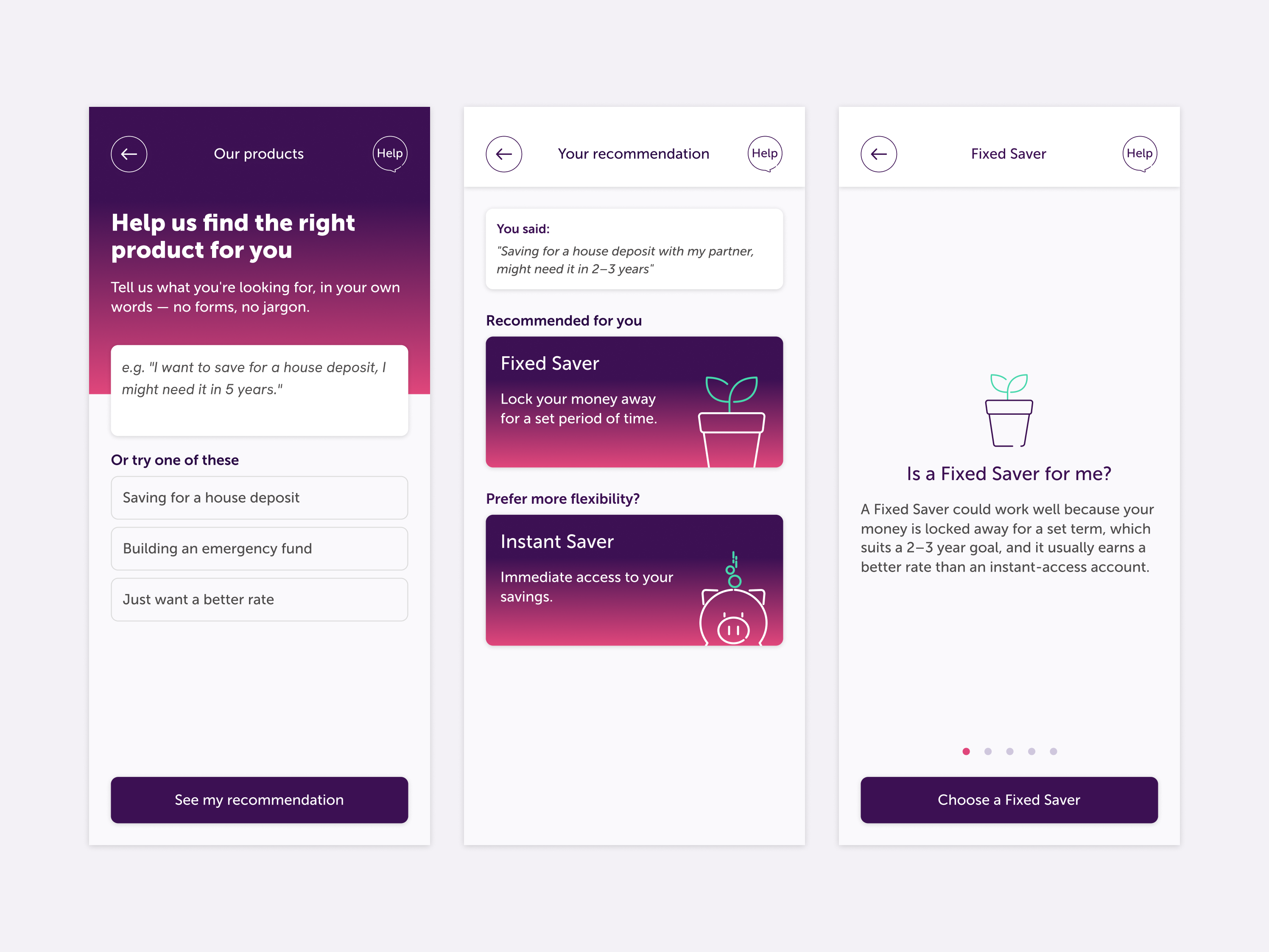
That setup produced four screens mapping onto the customer journey, from first prompt to handoff into the existing Browse flow:
- Screen 1 - Entry point: free-text goal input with three example prompts and voice input.
- Screen 2 - Recommendation: restates the customer's goal, then recommends a product with a one-line, plain-English "why."
- Screen 3 - Guardrail: "guidance, not advice" framing, plus an equally visible alternative; nothing opens without the customer choosing.
- Screen 4 - Handoff: drops into Atom's existing, unchanged Browse flow; only the entry point changes.
Iteration 1 - Interactive Figma prototype - Entry point → Recommendation → Guardrail → Handoff
I then checked in individually with a few team members between iterations rather than running full workshops, matching the pace of rapid prototyping: a chance to flag changes before testing, and to get each person's view from their own angle: feasibility, tone, and the guidance-vs-advice guardrail.
Iteration 2 - Interactive Figma prototype - Entry point → Recommender/Guardrail → FUE Screens → Product Term Selector
That check-in round produced real changes, not just approval:
- Rebuilt the entry point to match Atom's actual navigation chrome, not Claude's bespoke layout
- Merged Recommendation and Guardrail into one screen, keeping both options equally visible
- Reinstated the FUE screens and product term selector after Compliance flagged they couldn't be skipped
- Confirmed the only change to Atom's existing flow is the entry point and merged recommendation screen
Involved: myself (building the prototype), an iOS & Android Engineer (feasibility), a Copywriter (tone), and Legal & Compliance (guardrail sign-off). All were consulted and in agreement; none blocked the build.
Stage 4: Deliver
Deliver: test, refine, and validate it before it reaches a real customer.
I tested synthetically first. Recommendation logic run past simulated personas (first-time saver, rate-chaser, house-deposit saver) to sense-check it before recruiting real testers. A smaller, targeted round of real testing on UserTesting followed to confirm the strongest direction, meaning fewer directions reached full human testing, and the ones that did arrived stronger.
Synthetic testing here means role-playing a persona through the built screens rather than asking the model to critique the design outright, since that tends to manufacture issues regardless of whether the design has any.
I ran each persona multiple times across phrasing variants, since one output only tells you what the model said once, and kept persona descriptions to observable facts, not conclusions, since hinting at what the guardrail should catch guarantees the model catches it.
Every flagged issue was a hypothesis for real-user testing to confirm, not a validated result.
Example persona card
Persona card - Sarah, 29, House-Deposit Saver
Synthetic test: Sarah's scenario
- Tool used: Claude (Sonnet 5), Claude Code. Chosen for a fast, iterative first pass rather than a dedicated synthetic-testing platform, since this was the first time I'd tried an LLM-driven approach to pre-testing.
- Approach: Ran the same persona and prompt through the current prototype screens three separate times. I role-played Sarah's think-aloud rather than asking Claude to critique the design directly, to avoid the model manufacturing issues just because it was asked to find them.
- Prompt given (based on Persona: Sarah): "Saving for a house deposit with my partner, might need it in 2–3 years"
Claude Code running Sarah's scenario against the live prototype screens
What this tells us
The findings that repeated across all three runs, even after the data changed completely, the "lock" language and the button-commitment ambiguity, are the ones worth treating as real signal. The term-mismatch and rate-surprise findings only appeared once real figures replaced placeholders, a useful result in itself: fixing one problem surfaced the next.
Real-user testing
Synthetic testing consistently flagged where Sarah hesitated: the word "lock," and whether tapping "Choose a Fixed Saver" commits her to the product.
A model predicting hesitation isn't the same as a real person actually stopping, backing out, or getting confused, so this round tested whether those same friction points showed up with real people.
- Type of test: think-out-loud (TOL), UserTesting's unmoderated format for narrated, task-based sessions, chosen over an interaction test since I needed participants' reasoning captured on video, not just click data.
- Screener & task: people with a digital bank account, saving for a house deposit, asked to type their own goal into the entry point and think aloud through the recommendation, guardrail, and final term/amount screen.
- What we tested for: whether participants hesitated on "lock" given their own timeline, whether tapping "Choose a Fixed Saver" read as commitment or just a next step, and whether the fixed terms (1 year / 2 year) matched their stated timeframe.
Example test being set up in UserTesting
What participants said and did
- "Lock" language: One participant paused on the recommendation screen and said "wait, does that mean I can't touch it at all?", confirming the same hesitation seen across all three synthetic runs.
- Button-commitment ambiguity: One participant believed tapping "Choose a Fixed Saver" had opened the account when it hadn't.
- Term-length mismatch: Two noticed the 1 year / 2 year terms didn't match their stated "2–3 years" unprompted; the rest only registered it when a later question drew their attention to it.
All three were scoped as fixes, clearer guardrail copy on "lock," an explicit confirmation step, and surfacing the term mismatch earlier, but implementation is on hold due to other priorities. They're carried forward as known, unresolved friction points, not closed issues.
Involved: myself (Propositions Lead), running both testing rounds, with participants sourced through UserTesting.
4. Beyond the Diamond: Handoff & Measure
Kept outside the core four-stage model since it's what happens after a successful Deliver: I handed the validated concept, three known UX issues, and the evidence pack to the Savings Product Manager for roadmap prioritisation.
As of now, this is where the project sits: on hold, pending a decision on when it moves into a delivery sprint.
Measuring success
- How fast this concept moved from planning to a commercially-viable, tested concept
- Percentage of customers completing product selection via the guided flow versus the flat list, via a 50/50 split test
- Shift in deposit mix toward longer-duration products
Involved: myself, presenting the evidence pack; the Savings Product Manager, who owns the backlog from here; Head of Propositions for commercial sign-off; an iOS and Android engineer for delivery.
5. Reflection
This doesn't start from "let's add AI to Browse Products," it starts from a specific, evidenced failure (familiarity bias, no goal-matching), with a mechanism only proposed once Define converged on one hypothesis.
The Savings PM's cannibalisation concern was surfaced and carried forward as a monitoring commitment, not ignored. The guardrail accepts a small amount of friction, an extra "are you sure" step, for regulatory safety: a trade made deliberately.
Synthetic testing gave a consistency signal, the real-user round gave the actual number.
This Claude-based prototyping workflow isn't bespoke to this case study, it's the same rapid-prototyping approach I'll likely roll out across my other work as part of why Develop moved so fast.
If it gets the green light, the next step is a delivery sprint with engineering.
← Back to projects
Howard Laws
Get in touch
Rapid Prototyping
Conversational UI
Synthetic Testing
FinTech
Atom Bank: Rapid-Prototyping Propositions with Claude Code
A repeatable rapid-prototyping framework, built end-to-end with Claude Code, using a product recommender as the test case.
1. At a glance
This case study covers the framework itself, tested against a live proposition: a product recommender that asks a saver their goal and suggests the best-fit savings product instead of a flat list to compare. I also took on the Propositions Lead role as a stretch assignment, to see how I'd run a project like this end-to-end while still shipping fast.
- Role: UX Designer, sole practitioner, also acting as Propositions Lead for cross-functional facilitation
- Context: Atom Bank Savings Products proposition, adding an entry point to the existing Browse Products journey
- Timeframe: One week, end to end
- Tools: Claude Code, FigJam, Figma Design, UserTesting, Glassbox, Atom's Design System
- Roles involved: Savings Product Manager, Customer Support Agent, Head of Propositions, Head of Brand & Experience, iOS and Android Engineers, Copywriter, Legal & Compliance
- Deliverable: A repeatable framework for testing propositions before committing engineering time, proven out via the product recommender prototype.
2. The Double Diamond
What's interesting here isn't the product recommender, it's the framework behind it: getting from a proposition brief to a tested, guardrailed concept without a full research and delivery cycle. Two stages changed from a standard Double Diamond run:
- Develop: Claude turned a potential 1-2 day build into a few hours, producing a working, clickable prototype against the real design system, not a static mockup.
- Deliver: a synthetic testing gate runs simulated personas through the prototype's logic before real customers see it, catching edge cases that would otherwise only surface after a week of recruiting.
The Double Diamond: A Four-Step Process to Designing Solutions to Complex Problems
Conversations, testing, and stakeholder scheduling still ran on their own calendar; no tooling changes that.
3. Stage by Stage
The four stages below follow the Double Diamond shape, with the two adaptations layered in.
Stage 1: Discover
Discover: understand all relevant problems, causes, and knock-on effects.
Atom's Browse Products screen presents Cash ISA, Instant Saver, Fixed Saver and Mortgages as one flat, equal-weight list, with nothing connecting a customer's goal or time horizon to which product suits them.
Current Browse Products UI, plus supporting screen states
I grounded the brief in evidence from three sources:
- 6 customers who'd opened a savings product in the last 3 months, via semi-structured interviews
- 2 Customer Support Agents, on the "which account?" questions they hear most
- Glassbox funnel data on Browse Products drop-off
New-to-saving customers default to the most familiar-sounding option rather than the best fit, and nothing in the flow challenges that.
Involved: me (Propositions Lead), the Savings Product Manager, and a Customer Support Agent.
Stage 2: Define
Define: converge the evidence into one clear, agreed problem to solve.
I ran a short workshop with the Savings Product Manager, Head of Propositions, Head of Brand & Experience, and myself, to turn scattered evidence into one hypothesis the team could align behind. Findings reviewed:
- Glassbox: less than 38% of Browse Products sessions last quarter closed without opening an account.
- 4 of 6 interviewed customers picked the top-listed product without comparing others.
- Customer Support logs: an average of 40 "which account is right for me?" queries a month.
Current Browse Products UI, plus supporting screen states
Agreed problem statement
Customers without a strong product preference default to the most familiar-sounding option rather than the best fit. That's a loss both ways: the customer risks the wrong product, and Atom misses a chance to guide balances toward the mix it wants.
This wasn't unanimous on the first pass. The "loss both ways" framing was added after the Savings PM's cannibalisation concern, not there from the start.
Workshop outputs:
- An aligned problem statement
- An agreed hypothesis: guided selection beats an unweighted list
- Scope frozen to Savings for v1 (Mortgages flagged for v2)
- One risk flagged forward to Handoff: monitor Instant Saver balance impact once live
Involved: Savings Product Manager, Head of Propositions, Head of Brand & Experience, and myself (Propositions Lead).
Stage 3: Develop
Develop: generate and build a solution worth testing.
This is the stage built for real, not mocked up. A conversational entry point replaces the flat product list: the customer describes their goal (or taps the suggested prompts), and the interface returns a recommendation with visible, plain-English reasoning.
Design guidelines
- A conversational entry point (not a generic quiz) captures goal and timeframe in the customer's own words, then returns a recommendation with visible, plain-English reasoning.
- I designed the guardrail in from the start: guidance based on what the user said, plus a mandatory alternative the customer had to actively confirm before anything opened.
Rapid design with Claude
I synced Claude Code with the necessary Figma files, including the design system component library, via MCP, so it couldn't generate a mockup disconnected from the Atom brand and UX guidelines, and used it to wire up click-through interactions between the four screens so the prototype could be clicked end to end rather than reviewed as static frames.
Claude Code executing a build prompt against the synced Figma design system files
The four screens
That setup produced four screens mapping onto the customer journey, from first prompt to handoff into the existing Browse flow:
- Screen 1 - Entry point: free-text goal input with three example prompts and voice input.
- Screen 2 - Recommendation: restates the customer's goal, then recommends a product with a one-line, plain-English "why."
- Screen 3 - Guardrail: "guidance, not advice" framing, plus an equally visible alternative; nothing opens without the customer choosing.
- Screen 4 - Handoff: drops into Atom's existing, unchanged Browse flow; only the entry point changes.
Iteration 1 - Interactive Figma prototype - Entry point → Recommendation → Guardrail → Handoff
I then checked in individually with a few team members between iterations rather than running full workshops, matching the pace of rapid prototyping: a chance to flag changes before testing, and to get each person's view from their own angle: feasibility, tone, and the guidance-vs-advice guardrail.
Iteration 2 - Interactive Figma prototype - Entry point → Recommender/Guardrail → FUE Screens → Product Term Selector
That check-in round produced real changes, not just approval:
- Rebuilt the entry point to match Atom's actual navigation chrome, not Claude's bespoke layout
- Merged Recommendation and Guardrail into one screen, keeping both options equally visible
- Reinstated the FUE screens and product term selector after Compliance flagged they couldn't be skipped
- Confirmed the only change to Atom's existing flow is the entry point and merged recommendation screen
Involved: myself (building the prototype), an iOS & Android Engineer (feasibility), a Copywriter (tone), and Legal & Compliance (guardrail sign-off). All were consulted and in agreement; none blocked the build.
Stage 4: Deliver
Deliver: test, refine, and validate it before it reaches a real customer.
I tested synthetically first. Recommendation logic run past simulated personas (first-time saver, rate-chaser, house-deposit saver) to sense-check it before recruiting real testers. A smaller, targeted round of real testing on UserTesting followed to confirm the strongest direction, meaning fewer directions reached full human testing, and the ones that did arrived stronger.
Synthetic testing here means role-playing a persona through the built screens rather than asking the model to critique the design outright, since that tends to manufacture issues regardless of whether the design has any.
I ran each persona multiple times across phrasing variants, since one output only tells you what the model said once, and kept persona descriptions to observable facts, not conclusions, since hinting at what the guardrail should catch guarantees the model catches it.
Every flagged issue was a hypothesis for real-user testing to confirm, not a validated result.
Example persona card
Persona card - Sarah, 29, House-Deposit Saver
Synthetic test: Sarah's scenario
- Tool used: Claude (Sonnet 5), Claude Code. Chosen for a fast, iterative first pass rather than a dedicated synthetic-testing platform, since this was the first time I'd tried an LLM-driven approach to pre-testing.
- Approach: Ran the same persona and prompt through the current prototype screens three separate times. I role-played Sarah's think-aloud rather than asking Claude to critique the design directly, to avoid the model manufacturing issues just because it was asked to find them.
- Prompt given (based on Persona: Sarah): "Saving for a house deposit with my partner, might need it in 2–3 years"
Claude Code executing the synthetic test for Sarah's scenario
What this tells us
The findings that repeated across all three runs, even after the data changed completely, the "lock" language and the button-commitment ambiguity, are the ones worth treating as real signal. The term-mismatch and rate-surprise findings only appeared once real figures replaced placeholders, a useful result in itself: fixing one problem surfaced the next.
Real-user testing
Synthetic testing consistently flagged where Sarah hesitated: the word "lock," and whether tapping "Choose a Fixed Saver" commits her to the product.
A model predicting hesitation isn't the same as a real person actually stopping, backing out, or getting confused, so this round tested whether those same friction points showed up with real people.
- Type of test: think-out-loud (TOL), UserTesting's unmoderated format for narrated, task-based sessions, chosen over an interaction test since I needed participants' reasoning captured on video, not just click data.
- Screener & task: people with a digital bank account, saving for a house deposit, asked to type their own goal into the entry point and think aloud through the recommendation, guardrail, and final term/amount screen.
- What we tested for: whether participants hesitated on "lock" given their own timeline, whether tapping "Choose a Fixed Saver" read as commitment or just a next step, and whether the fixed terms (1 year / 2 year) matched their stated timeframe.
Example test being set up in UserTesting
What participants said and did
- "Lock" language: One participant paused on the recommendation screen and said "wait, does that mean I can't touch it at all?", confirming the same hesitation seen across all three synthetic runs.
- Button-commitment ambiguity: One participant believed tapping "Choose a Fixed Saver" had opened the account when it hadn't.
- Term-length mismatch: Two noticed the 1 year / 2 year terms didn't match their stated "2–3 years" unprompted; the rest only registered it when a later question drew their attention to it.
All three were scoped as fixes, clearer guardrail copy on "lock," an explicit confirmation step, and surfacing the term mismatch earlier, but implementation is on hold due to other priorities. They're carried forward as known, unresolved friction points, not closed issues.
Involved: myself (Propositions Lead), running both testing rounds, with participants sourced through UserTesting.
4. Beyond the Diamond: Handoff & Measure
Kept outside the core four-stage model since it's what happens after a successful Deliver: I handed the validated concept, three known UX issues, and the evidence pack to the Savings Product Manager for roadmap prioritisation.
As of now, this is where the project sits: on hold, pending a decision on when it moves into a delivery sprint.
Measuring success
- How fast this concept moved from planning to a commercially-viable, tested concept
- Percentage of customers completing product selection via the guided flow versus the flat list, via a 50/50 split test
- Shift in deposit mix toward longer-duration products
Involved: myself, presenting the evidence pack; the Savings Product Manager, who owns the backlog from here; Head of Propositions for commercial sign-off; an iOS and Android engineer for delivery.
5. Reflection
This doesn't start from "let's add AI to Browse Products," it starts from a specific, evidenced failure (familiarity bias, no goal-matching), with a mechanism only proposed once Define converged on one hypothesis.
The Savings PM's cannibalisation concern was surfaced and carried forward as a monitoring commitment, not ignored. The guardrail accepts a small amount of friction, an extra "are you sure" step, for regulatory safety: a trade made deliberately.
Synthetic testing gave a consistency signal, the real-user round gave the actual number.
This Claude-based prototyping workflow isn't bespoke to this case study, it's the same rapid-prototyping approach I'll likely roll out across my other work as part of why Develop moved so fast.
If it gets the green light, the next step is a delivery sprint with engineering.
← Back to projects
Howard Laws
Get in touch
Rapid Prototyping
Conversational UI
Synthetic Testing
FinTech
Atom Bank: Rapid-Prototyping Propositions with Claude Code
A repeatable rapid-prototyping framework, built end-to-end with Claude Code, using a product recommender as the test case.
1. At a glance
This case study covers the framework itself, tested against a live proposition: a product recommender that asks a saver their goal and suggests the best-fit savings product instead of a flat list to compare. I also took on the Propositions Lead role as a stretch assignment, to see how I'd run a project like this end-to-end while still shipping fast.
- Role: UX Designer, sole practitioner, also acting as Propositions Lead for cross-functional facilitation
- Context: Atom Bank Savings Products proposition, adding an entry point to the existing Browse Products journey
- Timeframe: One week, end to end
- Tools: Claude Code, FigJam, Figma Design, UserTesting, Glassbox, Atom's Design System
- Roles involved: Savings Product Manager, Customer Support Agent, Head of Propositions, Head of Brand & Experience, iOS and Android Engineers, Copywriter, Legal & Compliance
- Deliverable: A repeatable framework for testing propositions before committing engineering time, proven out via the product recommender prototype.
2. The Double Diamond
What's interesting here isn't the product recommender, it's the framework behind it: getting from a proposition brief to a tested, guardrailed concept without a full research and delivery cycle. Two stages changed from a standard Double Diamond run:
- Develop: Claude turned a potential 1-2 day build into a few hours, producing a working, clickable prototype against the real design system, not a static mockup.
- Deliver: a synthetic testing gate runs simulated personas through the prototype's logic before real customers see it, catching edge cases that would otherwise only surface after a week of recruiting.
The Double Diamond: A Four-Step Process to Designing Solutions to Complex Problems
Conversations, testing, and stakeholder scheduling still ran on their own calendar; no tooling changes that.
3. Stage by Stage
The four stages below follow the Double Diamond shape, with the two adaptations layered in.
Stage 1: Discover
Discover: understand all relevant problems, causes, and knock-on effects.
Atom's Browse Products screen presents Cash ISA, Instant Saver, Fixed Saver and Mortgages as one flat, equal-weight list, with nothing connecting a customer's goal or time horizon to which product suits them.
Current Browse Products UI, plus supporting screen states
I grounded the brief in evidence from three sources:
- 6 customers who'd opened a savings product in the last 3 months, via semi-structured interviews
- 2 Customer Support Agents, on the "which account?" questions they hear most
- Glassbox funnel data on Browse Products drop-off
New-to-saving customers default to the most familiar-sounding option rather than the best fit, and nothing in the flow challenges that.
Involved: me (Propositions Lead), the Savings Product Manager, and a Customer Support Agent.
Stage 2: Define
Define: converge the evidence into one clear, agreed problem to solve.
I ran a short workshop with the Savings Product Manager, Head of Propositions, Head of Brand & Experience, and myself, to turn scattered evidence into one hypothesis the team could align behind. Findings reviewed:
- Glassbox: less than 38% of Browse Products sessions last quarter closed without opening an account.
- 4 of 6 interviewed customers picked the top-listed product without comparing others.
- Customer Support logs: an average of 40 "which account is right for me?" queries a month.
Current Browse Products UI, plus supporting screen states
Agreed problem statement
Customers without a strong product preference default to the most familiar-sounding option rather than the best fit. That's a loss both ways: the customer risks the wrong product, and Atom misses a chance to guide balances toward the mix it wants.
This wasn't unanimous on the first pass. The "loss both ways" framing was added after the Savings PM's cannibalisation concern, not there from the start.
Workshop outputs:
- An aligned problem statement
- An agreed hypothesis: guided selection beats an unweighted list
- Scope frozen to Savings for v1 (Mortgages flagged for v2)
- One risk flagged forward to Handoff: monitor Instant Saver balance impact once live
Involved: Savings Product Manager, Head of Propositions, Head of Brand & Experience, and myself (Propositions Lead).
Stage 3: Develop
Develop: generate and build a solution worth testing.
This is the stage built for real, not mocked up. A conversational entry point replaces the flat product list: the customer describes their goal (or taps the suggested prompts), and the interface returns a recommendation with visible, plain-English reasoning.
Design guidelines
- A conversational entry point (not a generic quiz) captures goal and timeframe in the customer's own words, then returns a recommendation with visible, plain-English reasoning.
- I designed the guardrail in from the start: guidance based on what the user said, plus a mandatory alternative the customer had to actively confirm before anything opened.
Rapid design with Claude
I synced Claude Code with the necessary Figma files, including the design system component library, via MCP, so it couldn't generate a mockup disconnected from the Atom brand and UX guidelines, and used it to wire up click-through interactions between the four screens so the prototype could be clicked end to end rather than reviewed as static frames.
Claude Code executing a build prompt against the synced Figma design system files
The four screens
That setup produced four screens mapping onto the customer journey, from first prompt to handoff into the existing Browse flow:
- Screen 1 - Entry point: free-text goal input with three example prompts and voice input.
- Screen 2 - Recommendation: restates the customer's goal, then recommends a product with a one-line, plain-English "why."
- Screen 3 - Guardrail: "guidance, not advice" framing, plus an equally visible alternative; nothing opens without the customer choosing.
- Screen 4 - Handoff: drops into Atom's existing, unchanged Browse flow; only the entry point changes.
Iteration 1 - Interactive Figma prototype - Entry point → Recommendation → Guardrail → Handoff
I then checked in individually with a few team members between iterations rather than running full workshops, matching the pace of rapid prototyping: a chance to flag changes before testing, and to get each person's view from their own angle: feasibility, tone, and the guidance-vs-advice guardrail.
Iteration 2 - Interactive Figma prototype - Entry point → Recommender/Guardrail → FUE Screens → Product Term Selector
That check-in round produced real changes, not just approval:
- Rebuilt the entry point to match Atom's actual navigation chrome, not Claude's bespoke layout
- Merged Recommendation and Guardrail into one screen, keeping both options equally visible
- Reinstated the FUE screens and product term selector after Compliance flagged they couldn't be skipped
- Confirmed the only change to Atom's existing flow is the entry point and merged recommendation screen
Involved: myself (building the prototype), an iOS & Android Engineer (feasibility), a Copywriter (tone), and Legal & Compliance (guardrail sign-off). All were consulted and in agreement; none blocked the build.
Stage 4: Deliver
Deliver: test, refine, and validate it before it reaches a real customer.
I tested synthetically first. Recommendation logic run past simulated personas (first-time saver, rate-chaser, house-deposit saver) to sense-check it before recruiting real testers. A smaller, targeted round of real testing on UserTesting followed to confirm the strongest direction, meaning fewer directions reached full human testing, and the ones that did arrived stronger.
Synthetic testing here means role-playing a persona through the built screens rather than asking the model to critique the design outright, since that tends to manufacture issues regardless of whether the design has any.
I ran each persona multiple times across phrasing variants, since one output only tells you what the model said once, and kept persona descriptions to observable facts, not conclusions, since hinting at what the guardrail should catch guarantees the model catches it.
Every flagged issue was a hypothesis for real-user testing to confirm, not a validated result.
Example persona card
Persona card - Sarah, 29, House-Deposit Saver
Synthetic test: Sarah's scenario
- Tool used: Claude (Sonnet 5), Claude Code. Chosen for a fast, iterative first pass rather than a dedicated synthetic-testing platform, since this was the first time I'd tried an LLM-driven approach to pre-testing.
- Approach: Ran the same persona and prompt through the current prototype screens three separate times. I role-played Sarah's think-aloud rather than asking Claude to critique the design directly, to avoid the model manufacturing issues just because it was asked to find them.
- Prompt given (based on Persona: Sarah): "Saving for a house deposit with my partner, might need it in 2–3 years"
Claude Code running Sarah's scenario against the live prototype screens
What this tells us
The findings that repeated across all three runs, even after the data changed completely, the "lock" language and the button-commitment ambiguity, are the ones worth treating as real signal. The term-mismatch and rate-surprise findings only appeared once real figures replaced placeholders, a useful result in itself: fixing one problem surfaced the next.
Real-user testing
Synthetic testing consistently flagged where Sarah hesitated: the word "lock," and whether tapping "Choose a Fixed Saver" commits her to the product.
A model predicting hesitation isn't the same as a real person actually stopping, backing out, or getting confused, so this round tested whether those same friction points showed up with real people.
- Type of test: think-out-loud (TOL), UserTesting's unmoderated format for narrated, task-based sessions, chosen over an interaction test since I needed participants' reasoning captured on video, not just click data.
- Screener & task: people with a digital bank account, saving for a house deposit, asked to type their own goal into the entry point and think aloud through the recommendation, guardrail, and final term/amount screen.
- What we tested for: whether participants hesitated on "lock" given their own timeline, whether tapping "Choose a Fixed Saver" read as commitment or just a next step, and whether the fixed terms (1 year / 2 year) matched their stated timeframe.
Example test being set up in UserTesting
What participants said and did
- "Lock" language: One participant paused on the recommendation screen and said "wait, does that mean I can't touch it at all?", confirming the same hesitation seen across all three synthetic runs.
- Button-commitment ambiguity: One participant believed tapping "Choose a Fixed Saver" had opened the account when it hadn't.
- Term-length mismatch: Two noticed the 1 year / 2 year terms didn't match their stated "2–3 years" unprompted; the rest only registered it when a later question drew their attention to it.
All three were scoped as fixes, clearer guardrail copy on "lock," an explicit confirmation step, and surfacing the term mismatch earlier, but implementation is on hold due to other priorities. They're carried forward as known, unresolved friction points, not closed issues.
Involved: myself (Propositions Lead), running both testing rounds, with participants sourced through UserTesting.
4. Beyond the Diamond: Handoff & Measure
Kept outside the core four-stage model since it's what happens after a successful Deliver: I handed the validated concept, three known UX issues, and the evidence pack to the Savings Product Manager for roadmap prioritisation.
As of now, this is where the project sits: on hold, pending a decision on when it moves into a delivery sprint.
Measuring success
- How fast this concept moved from planning to a commercially-viable, tested concept
- Percentage of customers completing product selection via the guided flow versus the flat list, via a 50/50 split test
- Shift in deposit mix toward longer-duration products
Involved: myself, presenting the evidence pack; the Savings Product Manager, who owns the backlog from here; Head of Propositions for commercial sign-off; an iOS and Android engineer for delivery.
5. Reflection
This doesn't start from "let's add AI to Browse Products," it starts from a specific, evidenced failure (familiarity bias, no goal-matching), with a mechanism only proposed once Define converged on one hypothesis.
The Savings PM's cannibalisation concern was surfaced and carried forward as a monitoring commitment, not ignored. The guardrail accepts a small amount of friction, an extra "are you sure" step, for regulatory safety: a trade made deliberately.
Synthetic testing gave a consistency signal, the real-user round gave the actual number.
This Claude-based prototyping workflow isn't bespoke to this case study, it's the same rapid-prototyping approach I'll likely roll out across my other work as part of why Develop moved so fast.
If it gets the green light, the next step is a delivery sprint with engineering.
← Back to projects